12 Fall Wedding Color Combos Featuring Burnt Orange
There’s something magical about a fall wedding. Maybe it’s the crisp air, the golden light, or the way nature puts on its most spectacular show.
When I think of autumn, one color instantly comes to mind: burnt orange. It’s the color of changing leaves, cozy fires, and pumpkin spice everything.
It’s warm, it’s inviting, and it has this incredible ability to feel both rustic and sophisticated at the same time.
For years, I’ve seen couples gravitate towards this shade for their autumn celebrations, and for good reason. Burnt orange is surprisingly versatile.
It can stand out as a bold statement or act as a warm, earthy neutral. It pairs beautifully with so many other colors, allowing you to create a wedding palette that feels uniquely you.
If you’re dreaming of a fall wedding, let’s explore some stunning color combinations that put this perfect autumn hue in the spotlight.
Get more inspo here: 10 Stunning Fall Wedding Color Palettes and Rustic Romance: 20 Burnt Orange Wedding Ideas
Burnt Orange, Navy & Gold
This combination is the definition of classic elegance. The deep, rich navy provides a striking contrast to the warmth of burnt orange, creating a look that is both bold and balanced.
A touch of gold adds a layer of glamour and sophistication that elevates the entire palette. I think this trio is perfect for a more formal evening affair.
- How to use it: Imagine bridesmaids in elegant navy gowns carrying bouquets filled with burnt orange dahlias and rust-colored leaves. Groomsmen could wear navy suits with burnt orange pocket squares. For decor, think navy tablecloths with gold chargers and centerpieces that pop with burnt orange florals.


Burnt Orange, Emerald Green & Cream
Talk about a rich and earthy combination. This palette feels like a walk through a forest in late autumn.
The deep emerald green brings a sense of opulence and nature, while the burnt orange adds that essential warmth.


Cream softens the look, preventing it from feeling too heavy and adding a touch of romance. It’s a palette that feels grounded and luxurious.
- How to use it: You could have burnt orange and cream floral arrangements with cascades of emerald greenery. Stationery could feature cream paper with burnt orange and green botanical illustrations. A wedding cake decorated with burnt orange flowers and delicate green vines would be a showstopper.
Burnt Orange, Dusty Blue & Sage Green
For a softer, more romantic take on a fall palette, this is a beautiful choice. Dusty blue provides a cool, calming contrast to the fiery burnt orange, while sage green ties it all together with a gentle, organic feel.


This combination is less about the deep, moody tones of autumn and more about its soft, hazy light. It’s unexpected and utterly charming.
- How to use it: Consider mismatched bridesmaids’ dresses in dusty blue and sage green, with bouquets featuring pops of burnt orange. For table settings, dusty blue runners with arrangements of sage and burnt orange flowers create a dreamy tablescape.
Burnt Orange, Maroon & Mustard Yellow
This palette screams autumn from the rooftops. It’s a bold, warm, and confident combination that fully embraces the colors of the season.


The deep, wine-like maroon complements the burnt orange perfectly, while the mustard yellow adds a bright, cheerful spark. It’s a vibrant trio that feels joyful and full of life.
- How to use it: This is perfect for floral arrangements. Think bouquets and centerpieces filled with burnt orange roses, maroon chrysanthemums, and pops of yellow billy balls. Bridesmaids could wear rich maroon dresses, and groomsmen could sport mustard yellow ties.
Burnt Orange, Charcoal Gray & Taupe
If you’re aiming for a modern, minimalist vibe, this is your palette. Charcoal gray provides a sleek, contemporary base that makes the burnt orange truly stand out. Taupe adds a layer of warmth and softness, creating a sophisticated and understated look. It’s a chic and refined combination that proves fall palettes don’t always have to be rustic.


- How to use it: Picture a groom in a sharp charcoal gray suit with a burnt orange boutonnière. Decor could feature clean lines, with taupe linens and minimalist centerpieces of burnt orange florals in simple glass vases. Invitations with modern typography on charcoal paper would set the tone perfectly.
Burnt Orange, Terracotta & Ivory
This is an earthy, bohemian dream. By pairing burnt orange with terracotta, you create a tonal palette that is incredibly warm and inviting.
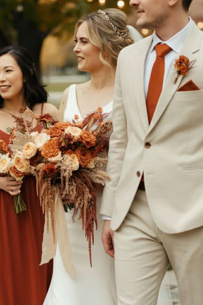

The different shades of orange and brown blend seamlessly. Ivory adds a necessary touch of lightness and elegance, keeping the palette from feeling one-note. It feels organic, warm, and very on-trend.
- How to use it: This is ideal for textures. Think terracotta pots filled with pampas grass and burnt orange florals. Bridesmaids could wear mismatched dresses in shades of terracotta and rust. An ivory wedding dress would look stunning against a backdrop of these warm, earthy tones.
Burnt Orange, Plum & Copper
Here’s a palette that feels incredibly rich and dramatic. The deep, jewel-toned plum offers a moody and romantic contrast to the bright burnt orange.


Adding metallic copper brings a warm, industrial-chic element that ties the two colors together beautifully. I find this combination to be daring and unforgettable.
- How to use it: Plum-colored tablecloths would make burnt orange and copper centerpieces pop. Grooms could wear a plum suit for a bold fashion statement. Copper mugs for signature cocktails and plum-colored napkins would add thoughtful details to the reception.
Burnt Orange, Forest Green & Brown
This is the quintessential rustic fall palette. It evokes the feeling of a cozy cabin in the woods. Forest green and brown create a natural, woodsy foundation that allows the burnt orange to shine as a vibrant accent. It’s a comfortable, warm, and timeless combination for a laid-back celebration.


- How to use it: This palette is perfect for a barn or outdoor wedding. Use wooden tables, forest green runners, and arrangements of burnt orange flowers and brown foliage. Bridesmaids in forest green with burnt orange shawls would fit the theme perfectly.
Burnt Orange, Teal & Magenta
For the couple that isn’t afraid of color, this combination is a knockout. It’s a vibrant and energetic take on a fall palette. The deep teal provides a cool, dramatic backdrop for the warm burnt orange, while a pop of magenta adds a surprising and playful touch. It’s a bold, creative, and joyful choice.


- How to use it: Use this palette in your statement florals, mixing burnt orange with vibrant magenta and teal ribbons. A teal lounge area with burnt orange and magenta pillows would create a fantastic photo op for guests. Groomsmen could wear teal suits for a truly unique look.
Burnt Orange, Dusty Rose & Gold
This combination is pure romance. Dusty rose softens the burnt orange, creating a warm and feminine palette. The addition of gold brings a touch of vintage glamour and sophistication. It’s a beautiful choice for a fall wedding that leans more romantic and less rustic. It has a timeless, storybook quality to it that I just love.


- How to use it: Imagine bridesmaids in flowing dusty rose dresses. Tablescapes could feature gold cutlery, dusty rose napkins, and centerpieces that blend both floral colors. A wedding cake with delicate gold leaf and sugar flowers in burnt orange and dusty rose would be exquisite.
Burnt Orange, Black & White
Striking, modern, and undeniably chic. Using black and white as a base creates a timeless canvas that allows burnt orange to be the star of the show. The high contrast is visually stunning and makes a powerful statement. This palette is for the couple wanting a formal, contemporary wedding with a seasonal twist.


- How to use it: This is all about clean, bold choices. A bride in a classic white gown with a bouquet of burnt orange calla lilies is a breathtaking image. Groomsmen in sharp black tuxedos with burnt orange pocket squares. Invitations could feature elegant black and white typography with a burnt orange accent.
Burnt Orange, Lavender & Gray
This is perhaps the most unexpected combination on the list, and that’s what makes it so special. The soft, gentle lavender provides a cool, whimsical contrast to the earthy burnt orange. A light gray acts as a sophisticated neutral that ties these two distinct colors together. It’s a unique and dreamy palette for a creative couple.


- How to use it: Use this in delicate floral arrangements, mixing sprigs of lavender with burnt orange ranunculus. Gray linens on reception tables would allow the colorful flowers to shine. Bridesmaids could wear lovely lavender gowns, creating a soft, ethereal look.
Embrace the Warmth of Burnt Orange
As you can see, burnt orange is so much more than just a single color; it’s a starting point for a wedding palette that is rich, personal, and perfectly suited for an autumn celebration. Whether you pair it with deep jewels tones, soft pastels, or classic neutrals, it brings a warmth and energy that is simply unmatched. Don’t be afraid to play with these combinations and find the one that tells your unique love story. Your perfect fall wedding is waiting.


